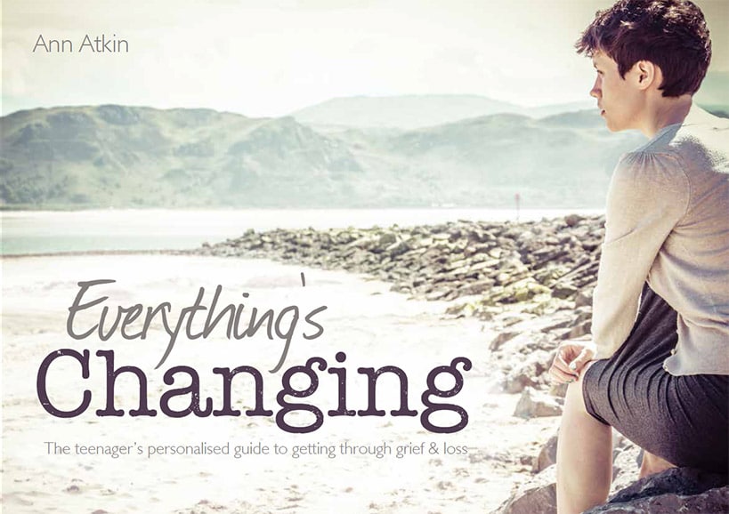
This was a brilliantly creative and worthwhile project to be involved with. Author Ann Atkin was in need of some modern editorial images for her new book project, Everything’s Changing, which helps teens & young adults deal with bereavement.
This was a subject close to my heart, as the lives of some of my own family members were devastated by loss as teenagers, and as a result of having no professional help or support they’ve never really recovered. As a result, I was really enthused & motivated to be part of a much-needed solution for others going through similarly traumatic times.
Over the last decade Ann has supported families through serious illness and bereavement and delivered awareness raising workshops on the impact of grief and loss to those who work with children and young people. Her work has been so recognised that she’s now part of bereavement forums on both local and national levels.
Ann and I shared an obviously mutual enthusiasm for the project, and so a couple of lively chats and numerous coffees later, I was commissioned to shoot the cover photograph, plus another major supporting image.
My Approach
As the style of the book was to be very graphical, and light on text, the impact of the images was incredibly important. As inspiration, I saturated myself in as much media aimed at the target demographic as I could. I wasn’t going to just copy what I came across, but getting a strong flavour for the right look and feel was paramount to hitting the spot.
The Cover Shot

This image had to be really evocative. I desperately wanted to avoid being clichéd, condescending or twee; but at the same time the message had to be clear and be relatable.
I chose a muted colour palette purposefully. A common feeling we experience after loss is that the colour in life has drained away somewhat. So, choosing tones to reflect this emotion was important.
Just one person is featured on the cover to emphasise the emotion of feeling sad & alone, which is echoed by the location choice of the quiet West Shore Beach, Llandudno. We chose a model with shorter hair, and went with simple classic styling that wasn’t overtly ‘girlie’, so as not to deter either sex from believing the book could be relevant to them.
I chose the viewpoint of looking over the model’s shoulder to de-emphasise her as a being the focal point, despite being the subject. I used her thoughtful gaze to lead our eye into the same wide open space she was lost in. So, rather than looking at her I wanted us to be looking with her.
Where Are You Now?

This image is used to provoke the question “Where do you see yourself fitting in this scene?” It took some setting up but I’m really pleased with how it’s turned out.
Ann and I were granted permission from Prestatyn High School to use their premises, and following a recce one afternoon we found this location that we really liked. It was a tuck shop / communal area that worked perfectly for us. This room held a secret weapon in the form of an unusual perspex roof, which let copious amounts of natural light in from directly above. This was such a bonus for creating the dramatically lit shot I was looking for and meant I didn’t have to drag around too much extra lighting.
Next, we met a group of willing drama students from the school, who were all keen to model for the scene we wanted to create. We chatted through the idea and I took a couple of quick grab shots so that Ann and I could discuss the characters we thought would suit the scene.

Two grab shots from the recce at the school and the initial meeting with our drama student models
A few short weeks later we were on location and, having made sure all the boring legal stuff like model release forms were all dealt with, we all had a lot of fun & laughter creating this shot!
The bulk of my time was spent setting up the scene and its lighting. It was very finicky and time consuming placing the components and people in exactly the right place, (helped so much by everybody’s patience and good spirits), but once everything was in alignment the shot came together incredibly well.
So, that’s the story of how I shot the two images for Everything’s Changing – The Young Person’s Guide To Grief & Loss. There are some free downloadable pages from the book available on the website, so why not hop over and check it out?

